— work/healthcare regulatory
membership · credentialing · 2023

Lifting member retention by 5% at RAPS, a specialty-credentialing society.

Senior Product Designer on the RAPS member platform — the Regulatory Affairs Professionals Society, the credentialing body for the healthcare regulatory profession. Restructured the subscriber journey IA and ran a three-round usability program against one number: retention.

— who

RAPS — Regulatory Affairs Professionals Society

— what

Member-platform UX research · IA work · retention reasoning

— result

+5% subscriber retention on a 40,000-visitor/day platform

— scope

engagement · UX research · IA · retention reasoning

RAPS.org homepage in production — the intent-first 'What are you looking for?' framing and category chip cluster from the IA work shipped to the live site.

— outcomes

+5%

subscriber retention on the member platform

40k / day

visitor scale at the time of the engagement

3 rounds

usability tests behind the IA changes

outcome

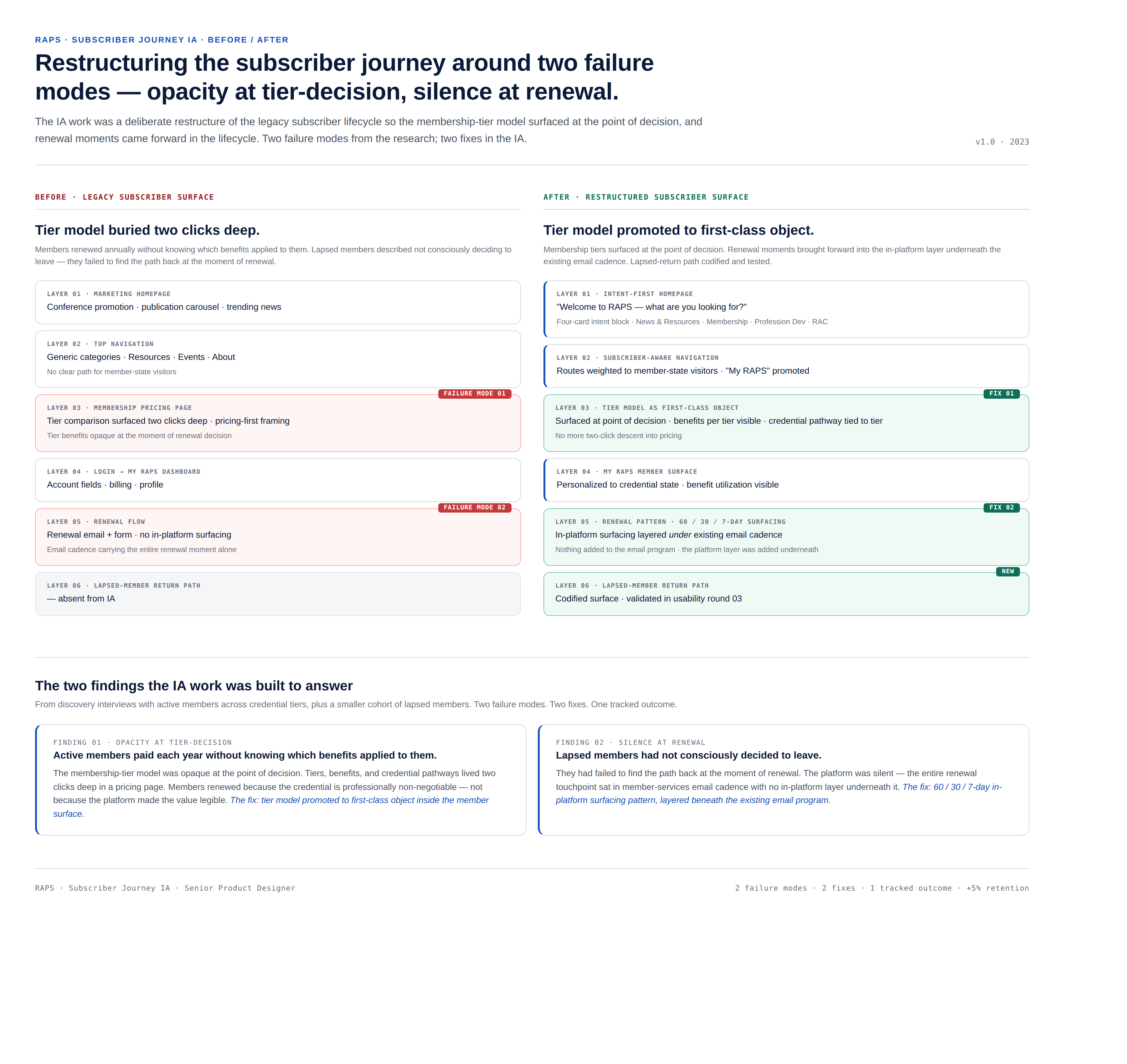
+5% retention, in the first quarter after launch.

A restructured subscriber journey lifted retention by 5% within the first quarter after launch — meaningful recurring-subscription revenue for a professional association serving 40,000 daily visitors. The gain came from clarifying the membership-tier IA and surfacing renewal moments earlier in the subscriber lifecycle.

For a credentialing society where members renew annually and a lapsed credential is expensive to recover, 5% compounds. The change was IA, not branding — no new logo, no homepage rewrite, no marketing campaign sat behind the number.

users + needs

Designing for credentialed regulatory professionals — not casual subscribers.

The member base is regulatory affairs professionals — the people who get medical devices, drugs, and biologics through the FDA, EMA, and Health Canada. They are senior, time-poor, and renew because the credential is professionally non-negotiable, not because the platform is delightful.

Lapsed members told us the same thing in different words: they had not consciously decided to leave; they had failed to find the path back at the moment of renewal. Active members described the membership-tier model as opaque — they paid each year without knowing which benefits applied to them.

Two signals pointed the IA work in one direction: renewal moments needed to be surfaced earlier in the subscriber lifecycle, and the membership-tier model needed to be legible at the point of decision, not buried two clicks deep.

my role

Senior Product Designer on a small cross-functional team.

As Senior Product Designer, I worked alongside the platform's product manager, lead engineer, and a member-services lead who owned the renewal pipeline. We each owned a slice: the PM owned roadmap and stakeholder alignment, engineering owned the migration of the existing CMS, and member services owned the renewal touchpoints email-side.

My specific responsibilities were the primary research with active and lapsed members, the IA restructure of the subscriber journey, the wireframes the team built against, and the measurement plan that connected the IA changes to retention as the single tracked outcome.

the mandate

Lift annual renewal retention without a platform replatform.

The brief from the executive sponsor was specific: improve renewal retention against a fixed CMS, on the live platform, without a multi-quarter replatform project. Anything that required a rebuild of the underlying member system was out of scope. The success bar was a measurable retention lift verified at the end of the first renewal cycle after launch.

phase 01 · discovery

Discovery — interviews with active and lapsed members.

We ran a two-week discovery sprint: structured interviews with active members across credential tiers, plus a smaller cohort of lapsed members who had not renewed in the previous cycle. The conversations were short (45 minutes), scripted, and aimed at one question: where did the member-platform relationship break down?

The discovery output was a journey map of the subscriber lifecycle annotated with two failure modes — opacity at the tier-decision moment, and silence at the renewal moment. These two failure modes became the brief for the IA work.

phase 02 · ia

IA restructure — making the membership-tier model legible.

We restructured the subscriber-area IA so that the membership-tier model surfaced at the point of decision — what each tier offered, what the member was paying for, and which credential pathways the tier opened. The tier model went from a buried pricing page to a first-class object inside the member surface.

Renewal moments were brought forward in the lifecycle: a 60-day, 30-day, and 7-day surfacing pattern in-platform, paired with the existing email cadence the member-services team already owned. Nothing was added to the email program; the in-platform layer was added underneath it.

phase 03 · usability

Three rounds of usability testing against retention scenarios.

We ran three usability rounds against scripted retention scenarios — a member arriving at a renewal screen, a member comparing tiers, a member returning after a lapse. Each round closed a specific pattern: round one corrected the tier-comparison surface, round two tightened the renewal-flow language, round three validated the lapsed-member return path.

We shipped the IA changes in the third week after testing closed. The retention number was tracked across the first full renewal cycle and verified by the platform's own analytics before this case study was written.

evidence

What shipped, and the reasoning behind it.

Subscriber-journey IA, before and after — opacity at tier-decision and silence at renewal mapped to two fixes
Subscriber-journey IA, before and after — opacity at tier-decision and silence at renewal, mapped to two fixes.
Annotated wireframe of the proposed RAPS homepage IA
Annotated wireframe of the proposed homepage IA — intent block, search, category-aware content, member-aware navigation.
High-fidelity comp of the RAPS homepage IA in brand
High-fidelity comp — the IA dressed in RAPS brand: navy hero, four-card intent block, category chip cluster, member-aware lower fold.
Live RAPS.org homepage in production with the intent framing and category chip cluster
Live RAPS.org homepage — the intent framing and category chip cluster reached production.
testimonial

Dima is a talented designer! I worked with him on many projects and he is quick and on-target every time. I highly recommend him!

Wendy Walters · Nonprofit Information Technology Strategist · LinkedIn recommendation

— bottom line

+5% subscriber retention lifted on a 40,000-visitor/day member platform · subscriber journey IA restructured against two failure modes — opacity at tier-decision and silence at renewal · 3 rounds of usability testing scripted to retention scenarios, not feature checklists.