— work/payment platforms · design system · 2022–24
payment platforms · design system · 2022–24

Unifying five inherited UI libraries at Vanco — and shipping a token-driven design system across 40 products.

I led the design-system effort at Vanco Payments — auditing five inherited UI libraries from acquired sub-brands, defining a three-tier token architecture, and shipping a unified component library consumed across 40 products. Output: 24 core components, 208 tokens in three tiers, and a foundation that absorbed the 2023 corporate brand unification as a token swap rather than a forty-product redesign.

— who

Vanco Payments · payment platform serving faith, education, child-care, and corporate verticals across 40 products

— what

Design System · OOUX · Token Architecture · Component Library · Federated Governance · Brand Consolidation

— result

5 libraries → 1 system · 24 components shipped · 208 tokens · 40 product surfaces consuming

— scope

full-time Senior Product Designer · Jul 2022 – Jan 2024 · system lead

Three-tier token architecture — foundation, semantic, component — bound to one source of truth.

— outcomes

40

product surfaces consuming the system

208

tokens · three tiers · one source of truth

5 → 1

libraries unified · brand swap absorbed

problem

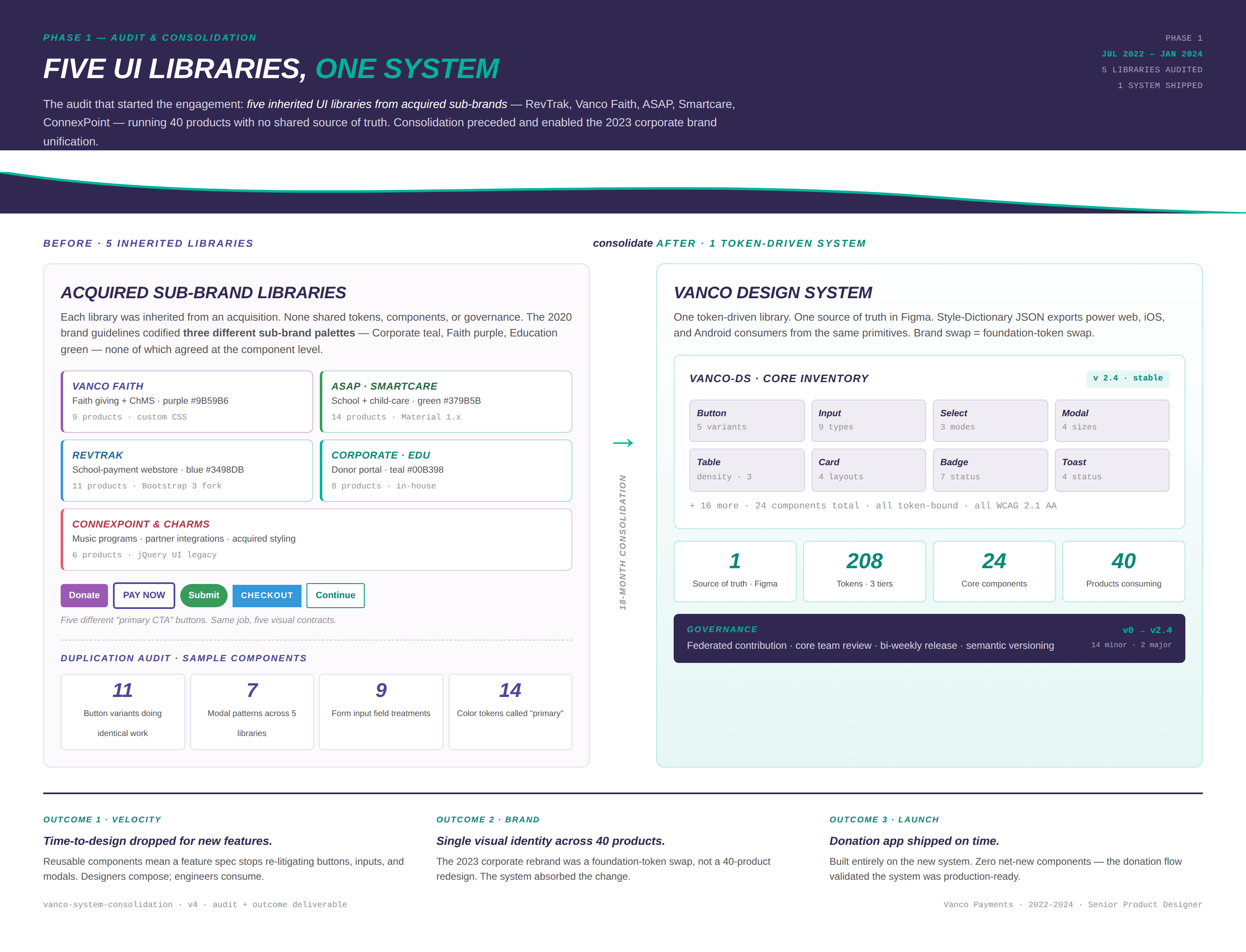
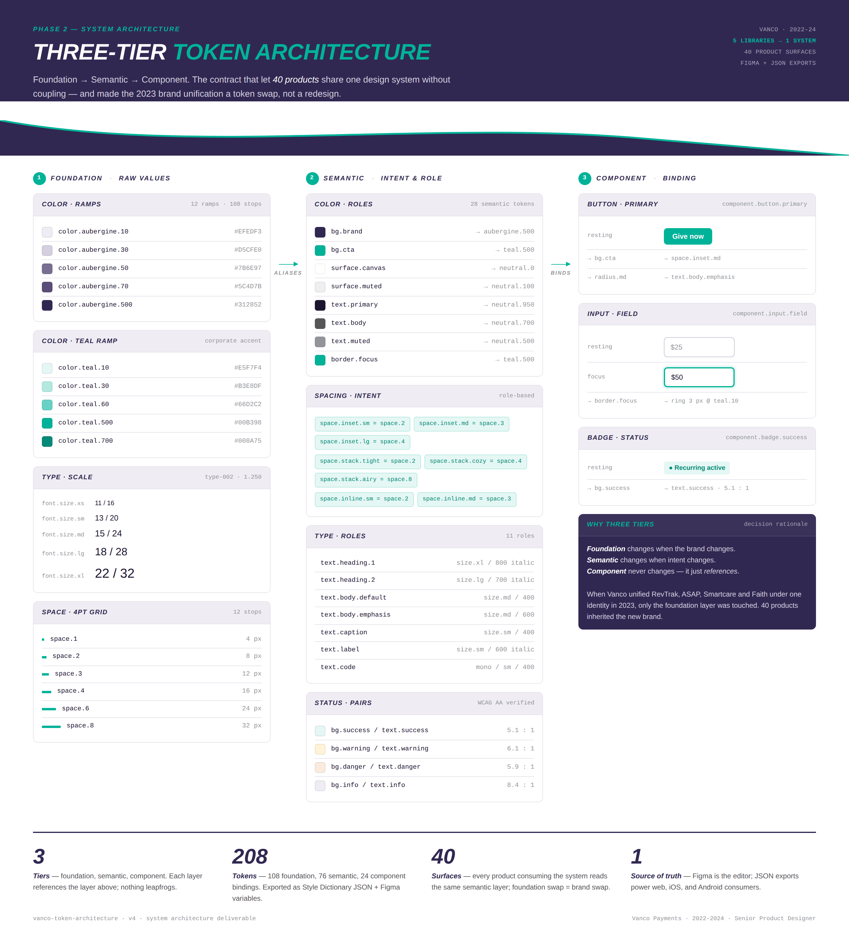
five UI libraries inherited from five acquisitions — and no shared source of truth.

By 2022, Vanco had grown through acquisition into a payment platform serving 40+ products across faith giving, school payments, child-care, food service, and enterprise donation. Each acquisition arrived with its own UI library — RevTrak's Bootstrap fork, Vanco Faith's custom CSS, ASAP and Smartcare on legacy Material, ConnexPoint and Charms on jQuery UI. Five libraries. Five different "primary CTA" buttons doing identical work. 11 button variants, 7 modal patterns, 14 color tokens called "primary." The 2020 brand guidelines codified three different sub-brand palettes — Corporate teal, Faith purple, Education green — that had never been harmonized at the component level. Every product team was re-litigating buttons, inputs, and modals from scratch, and the brand unification leadership knew was coming had no system layer to absorb it.

users

designing for product teams, not just end users.

The system's primary users aren't the donors, parents, or school administrators on the consuming surfaces — they're the product designers and engineers across Vanco's eighteen-plus federated contributors who need to ship features on a deadline without re-litigating component primitives. The job: give them a system fast enough to use that going around it stops being attractive.

That meant treating product teams as a customer segment with their own jobs to be done — composing flows, not designing controls. Reusable buttons, inputs, modals, payment-method selectors. Documentation that answers questions before they become Slack threads. A federated contribution model so the system grows without bottlenecking on the core team.

The signal in the rollout was sharp: when the donation app shipped on the system in 2023 with zero net-new components, the system had passed its production-readiness test — and the 2023 corporate brand unification became a foundation-token swap rather than a forty-product redesign.

role

Senior Product Designer · system lead.

Full-time engagement, July 2022 to January 2024. I led the system end-to-end — audit through token architecture through OOUX introduction through governance — partnering with engineering and product across all consuming surfaces.

process

the mandate: unify five libraries without freezing 40 product roadmaps.

phase one — audit & consolidation

Inventoried the five acquired libraries against each other and against the live products consuming them. Mapped duplications: 11 button variants doing identical work, 7 modal patterns, 9 input field treatments, 14 color tokens called "primary." Documented the actual sub-brand palettes from the 2020 brand guidelines — Corporate teal #00B398, Faith purple #9B59B6, Education green #379B5B — codified at headquarters but never reconciled at the component level. The audit became the strategic case for the rebuild and the brief leadership signed off on.

phase two — system architecture

Three-tier token model: Foundation (108 raw values), Semantic (76 intent tokens), Component (24 component bindings). Foundation changes when the brand changes; Semantic changes when intent changes; Component never changes — it just references. Introduced OOUX as the IA method for the donation domain — 10 objects across three layers (Actor, Domain, Event), naming Channel as a first-class object that prior surfaces had collapsed into per-product hardcoding. The object roster became the contract between design, engineering, and integration partners.

phase three — launch & governance

Donation app shipped on the system in 2023 — five-screen donor flow, every screen consuming the existing component library, zero net-new components. That validated v2 was production-ready. Formalized the governance model in parallel: three roles (core team, federated contributors, consumers), a seven-stage contribution pipeline, bi-weekly release cadence, semantic versioning, and a 90-day deprecation contract. The 2023 corporate brand unification shipped as a v2.0 major bump — foundation tokens swapped, consumers had 90 days, zero hot-fix sprints.

evidence
Three-tier token architecture diagram — foundation, semantic, component layers
Three-tier token architecture — foundation, semantic, component.
Phase one audit consolidating five inherited UI libraries into one token-driven system
Phase one audit — five inherited libraries to one token-driven system, with the 2020 sub-brand palettes documented at source.
Component coverage matrix — 24 components across 12 product families
Component coverage matrix — 24 components × 12 product families · adoption tracked quarterly.
OOUX object map for the donation domain — ten objects across three layers
OOUX object map for the donation domain — ten objects across three layers.
Donation app launch — five-screen flow consuming fourteen design-system components
Donation app launch — five-screen flow, fourteen DS components, zero net-new.
Operating model — three roles, seven-stage pipeline, ninety-day deprecation contract
Operating model — three roles, seven-stage pipeline, ninety-day deprecation contract.
testimonial

“He stands out for his outstanding communication skills, which are crucial in translating complex design concepts into clear, actionable insights for the entire team.”

Dima and I collaborated on many user studies together where we interviewed clients to understand the pain points in their product experience. Dima brings a unique blend of creativity and empathy to the table, ensuring that the end user's experience is always at the forefront of his design decisions. Dima is an incredible UX designer who not only excels in creating intuitive and visually appealing interfaces but also thrives in a collaborative environment.

Stephanie Scott · Senior Product Marketing Manager · Vanco Payments

— bottom line

24 components shipped for the new unified design system · 208 tokens architected across foundation, semantic, and component tiers · five inherited UI libraries consolidated into one source of truth across 40 product surfaces.